
Picking the colour palette to paint your home can be a tricky decision. Everything from the lighting, furniture, art and the occupant’s personal tastes have to be factored in. People spend a lot of time looking for inspiration and unless you have professional guidance, the results may be less than flattering.
How do you know which colours will go together, and where exactly do you have to begin? Stay with us as we help you navigate through the process of home colour selection and help you choose the right hues that will liven up your home.
Colour Selection for Rooms: What Type of Paint Should I Choose?

Painting is a quick and easy way to add a breath of fresh air to your home. However, there’s a multitude of choices when it comes to the types of paints available. Each has their own strengths and are suitable for specific use cases. Let’s go over the basics of the types of paints available on the market.
You can find paints in oil or latex forms. They are also available in a variety of sheens. People generally prefer using latex paints because they are durable, long-lasting and easy to clean. Moreover, the latex breathes better than oil and suffers less fading and blistering over time. So, it is recommended to go for latex paints for your home walls and other household purposes.
On the other hand, oil-based paints are very good at sealing stains and knots from the wood as compared to latex paints. Therefore, they work best for priming real wood mouldings and trim. Oil-based paints take longer to dry, so be prepared for more drying time. You can also get the best of both worlds by putting an oil-based shellac primer as a first coat and then coating it with a second layer of latex paint.
The Impact of Colours on your Psyche
You may have noticed how some places have an ambience that relaxes and calms you down, while some tend to arrest your attention. The colour palette used has a great impact on the kind of emotions evoked when you enter a space. Each colour’s impact on our emotional state has to be taken into account while choosing paints for your home. To help you out we’ve compiled a ready reference on colours and the feelings they evoke when used in a room.
Colour theory:
It is recommended to avoid using more than three colours while painting a room for any space. While picking colours use a colour wheel to visualize which colours go with each other. A colour wheel has 12 colours made from the combination of the primary colours Red, Blue and Yellow. Use colours across each other to understand it’s complementary pairing. For example; Turquoise works with Peach, Purple pairs with yellow and so on. You can use free websites such as Paletton to help understand and experiment with colour shades and combinations.
Red:
The colour red is a symbol of love, courage and passion. It exudes warmth and draws attention.This makes it an ideal choice for a community space such as the living room.
Orange:
Orange is considered as a cheerful colour. It represents knowledge, loyalty and generosity. As it mirrors a healthy social environment and has a vitalizing impact on the mind and body, however, since it’s a very bold colour it is better used sparingly on accent walls rather than the entire room.
Yellow:
Symbolizing wealth, sunlight and spirituality, yellow is among the widely-used colours used to paint small-sized homes in cities. It radiates joy, warmth and inspiration and gives the room a bright look. Hence it can be used in spaces where you want to amplify the natural light.
Green:
The colour green is a depiction of freshness and abundance. It has soothing qualities and highlights the power of nature. Having a green accent wall in your bedroom can have a therapeutic effect and promote wellbeing and rest.
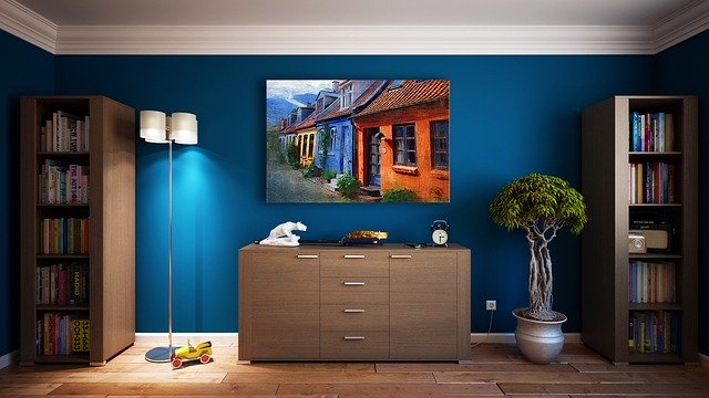
Blue:
Blue is the colour of comfort, tranquillity and serenity. As the colour is associated with the sky and water, it is ideal for bathrooms. It induces sleep by calming the mind, and therefore, can be used to paint the bedroom walls. You can use a shade of Mediterranean blue to blur the room’s boundaries and make it look bigger than it actually is.
Purple:
Purple exudes luxury, royalty, sensuality and depth of feeling. Hence it can be used to bring a regal touch to your home.
Black and white:
White connotes elegance and purity, and black, on the other hand, is associated with power and charisma. If you wish to do more than just a plain white wall, you can use different shades of white. You can also go for a white shade with blue, green or pink tones to make your room appear bigger and vibrant. Use black in a room with light-coloured walls to add contrast.
Gloss Finish or Matte?
When we select a colour scheme to create the ideal ambience according to our needs, there is one important aspect that we should pay attention to, i.e. the paint sheen or gloss.This decides how the light reflects off the walls and plays a huge role on the lighting of a particular space.
Glossier paints are easier to clean up. If you are painting a room where people move around a lot, such as a playroom or a kitchen, there is a high chance of getting grease on the wall. Hence, it is better to select a high gloss paint for the kitchen as you can easily clean the wall by wiping it down with a damp sponge. One downside to using high gloss paint is that they make blemishes and imperfections noticeable. So, if you are using them in living rooms, any imperfections may be glaring to visitors and guests. High gloss can be ideally used for the trim as they complement and accentuate the corners that you are looking to highlight.
Semi-gloss paints are a great option as well to paint the kitchen, bath and trim. They offer less shine than the gloss and are easy to wash. They cost slightly less than the gloss paints and are a commonly used alternative. Paints with satin sheens are also available. They have a satiny smooth finish to them and work well for kitchens, baths and hallways.
However, if you have walls with imperfections, it is better to select a flat or matte paint for house interior wall colouring. Usually, one coat of matte paint helps hide away the blemishes. The problem with matte paints is that it is difficult to clean and any dirt or grease becomes more evident. So, it should be used for rooms that won’t get lots of fingerprints and dirt on them.
Another popular option of sheen is eggshell, which does a good job of hiding imperfections like matte paint but is easier to wash and is more durable. The eggshell sheen probably has got the best of both flat and glossy paints.
Choosing Colour Shades: How to Get Started?
Choosing the best colour for your home can seem like a daunting task, which is why many people tend to go for white or neutral shades to paint their walls. But, making a colour selection for your home that is in harmony with the walls, furniture and decorative elements is essential to add a personality to your space. Besides, colour is one element that is quite easy to change around if you start to find it unexciting.
Below mentioned are a few tips to help you pick out home colour selections that are best for your home.
-
Start from the bottom
Whenever you are planning to create a colour palette, it is helpful to start with your flooring first. Your floor significantly impacts your colour choices and decisions, which in turn shapes the way you use textures, tones, accents and artwork. When you have decided your flooring, you can work with complementary or contrasting fabric colours for curtains, furniture, tiling and other styling elements.
-
Avoid dark colours for the ceiling
You need to keep in mind that using a darker tone for a ceiling can make a room feel enclosed, hence it’s better to stick to neutral colours such as white, grey, or beige. If you are wondering whether to go for gloss paint or a matte one, know that it is always better to choose a matte finish to paint your ceilings. Gloss paint can’t hide small imperfections, so it’s difficult to get a seamless look.
-
Add life to your walls
When painting your walls, make sure you choose colours that complement each other on the colour wheel ie (Are opposite to each other on the wheel). If you want to spice things up and add life, you can choose a pattern or wall paper for one of the walls in the room while keeping the other walls neutral. You can also experiment with Photo frames, art, or even knick knacks such as your old vinyl records to add personality to your wall.
-
Pay attention to skirting boards
Over time, skirting boards can wear out. So, use enamel paint for durability. White always looks good, but if you have used light colours on the walls, you can use the same for your skirting boards.
-
Follow the three-colour rule
Three colours are the maximum you should be using for any portion of your house. You can use one for the walls, one for the trims and one for accents. Remember that they have to match tonally to complement one another. Besides, three colours are just enough to coat, outline and accent your house.
-
Use neutral colours for exteriors
Neutral colours like beige tend to look good when used on house exteriors. They blend in perfectly with the streetscape and make your house look beautiful when used with the right combination. Some of the colour schemes you can try are natural and earth-based colours like the warm greys and dark charcoals, which really accentuate the bricks, stone and greenery if you have a garden or porch space in front of your home.
-
Choose colours that speak of your house’s history
Houses look amazing if you could choose a colour scheme to match the architecture and era of your home. You can follow the traditional hues like that of Victorian houses in reference to the history of your home, or you can take a more modern approach and select styles of the era like Art Deco, mid-century modern, or some 1970s flair.
Choosing the style
For a soothing effect:
For a soothing effect such as in your bedroom, you can go for a monochromatic approach. Light colour choices like pink, lavender, blue and soft yellow work best to create a feeling of tranquillity and restfulness in a room. If you want a calm ambience in your bedroom, go for lighter shades of cool colours. You can choose your favourite colour and try looks by overlapping complementary shades. For example, if you are using a darker colour for the wall, you can use a lighter shade for the trim. Besides, you can also use varying shades within the same colour scheme for curtains, bedding and other accessories.
For an elegant look:
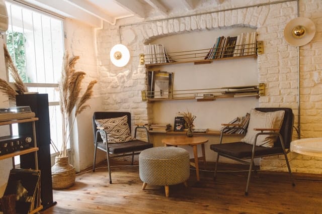
Using neutral colours within a room exude elegance, hence these are good picks for your living room or study. You can use varying shades of neutral colours, such as almond walls that have red-toned browns on the trim. You can also add splashes of colour throughout the room or accessorize the place with matching throw pillows or vases to offset the neutral tones in the room. With neutral colours, it is easier to change the feel of a room by adding different coloured accessories or giving a new colour to the trim. Remember, the lighter your shades, the spacious your room will look. While choosing paint colours for the living room, you can go for shades of rust, mahogany or garnet to create instant elegance and a feeling of earthiness and richness.
For a vibrant look:
To create a vibrant look, you can choose bright colours such as shades of orange, red, gold and dark purples. You can also select black and red for a real stand out contrast. This combination brings out a look that is reminiscent of an oriental look. However, ensure that you use these sparingly as overdoing these bright colours can have a jarring effect.
Home Painting Tips and Tricks
Before painting, clean the dirty surface for a stronger bond
The paint can peel off or chip easily if applied over dirty and oily surfaces. Therefore, it is necessary to clean the surface with a deglosser or a heavy-duty cleaner before painting. They can effectively clean off the painted, varnished or enamelled surfaces to enhance the adhesion of the new paint. The cleaners can also be used to clean greasy or oily areas of the kitchen and bathroom walls. Follow a circular motion to wipe the surface using a lint-free cloth or abrasive pad. You can then fill in any nicks and sand them smooth before painting. Wear rubber gloves and eye protection during the job.
For consistency, use a large bucket to mix the cans of paint and then use it
Paint colours may be different in each can. So, if you are in the middle of the wall and open up a new can to finish painting the rest, you may notice different hues. To eliminate this problem, you can follow a process called boxing. All you need to do is to estimate the amount of paint you’ll need and then mix all of it in a bucket. You can then use this to paint the room. If you can’t get an accurate estimate of the paint you need, you can just add more to the bucket and pour the remaining paint back into the cans once you’re done.
Always roll the full height of the wall and maintain a wet edge
When you roll over paint that has partly dried out, uneven layers of paint build-up can occur resulting in unpleasant stripes. If you are using latex paint in warm and dry conditions, you have to be extra careful as they dry up and stiffen pretty fast.
The key to preventing marks from appearing is to maintain a wet edge so that each stroke of the paint roller overlaps the previous stroke before the paint dries up. To maintain a wet edge, start painting from a corner and run the roller up and down the height of the wall. Make sure that you are moving across slightly with each stroke. If you see any thick spots or runs, move backwards and even it out.
The roller shouldn’t be dry. Keep dipping it often so that it is always at least half loaded with paint. Also, keeping the open side of the roller frame towards the painted area will put less pressure on it and ensure no paint ridges are left.
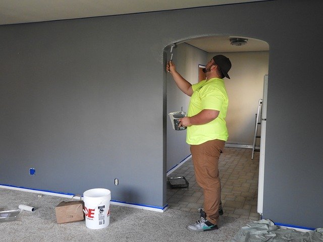
Start with painting the trim and then go to the ceiling and walls
It is a lot easier and faster to tape off the trim than the walls. So, it’s better to paint the trim first and then the ceiling and the walls. While painting the trim, focus on getting a smooth finish on the wood. It is okay if you splashed a bit of trim paint on the walls. It can later be covered when painting the walls. Leave the paint for at least twenty-four hours to completely dry out. You can then tape it off and move on to paint the ceiling and the walls.
Cut the tape loose off the trim only after the paint has completely dried
Once the paint is dry, a thin film forms between the wall and the tape. If you try to pull the tape off the trim as soon as the paint is dry, you might tear off pieces of dried paint off the wall as well. So, you must cut the tape loose before pulling it out.
Use a sharp utility knife to cut through the film. Choose a small spot to poke through and test whether the paint has dried enough to make a clean slice. After you cut through the pain, pull the tape at a 45-degree angle.
Priming is important to eliminate texture differences
After you are done painting the walls, you may see that the walls look blotchy and the sheen lacks consistency although the colour is uniform. This happens over the holes and cracks you patched with a filler or drywall compound. The porous fillers absorb the paint and dull the surface. You can notice these dull spots when light falls on the surface.
To deal with this problem, you can apply a quick coat of primer. The primer seals the patch and doesn’t let the paint sink in. You can prime with a roller feathering out the edges to eliminate texture differences.
Use a brush as well as a roller to paint along the edges
If you use only a brush to paint the corner and areas around the trim, there will be a noticeable texture difference surrounding the area. Therefore, it is important to apply the paint using a brush first and then roll it out immediately to ensure consistency in the finished texture. A 3-in. roller with a nap as thick as the roller will work fine.
Avoid using plastics. Use canvas drop cloths instead
Regardless of how careful you are, you cannot stop paint spills and splatters from happening. So, it’s far better to be prepared than cleaning them from your carpeting or wood floor later. You can just cover your work area with canvas drop cloths and start painting. The thick canvas doesn’t need taping and can be used to cover any surface. Plastic drop cloths are available as well, but they are slippery to walk on or set a ladder on. What’s worse is the paint spills stay wet on the plastic which can end up on your clothes or shoes and stick to other places as you walk around the house. On hard floors, the canvas can be slippery, so you can use rosin paper instead over vinyl, tile and hardwood. You will still have to take care to wipe up large spills right away or they will seep through.
Feather out the paint along the edges when a wet edge doesn’t seem possible
It is not possible to cover large areas like ceiling or stairwells in single or continuous strokes. Therefore, you need to feather out the paint along the edges that you can’t keep wet to minimize lap marks on these areas. To avoid leaving lap marks while painting large areas, roll the nearly dry roller in different directions along the dry edge, feathering out the paint as you go. After you are done with the complete length of the wall or ceiling, move to the next section and paint over the feathered edges. Apply the paint in the opposite direction for the second coat. Although this crisscross way of painting an area doesn’t eliminate lap marks, it is quite good in reducing them.
Sand trim before applying a second coat
Using just one coat of paint won’t be enough to hide the underlying colour and sheen on the trim. Besides, you also have to sand the surface smooth between coats to avoid getting a grainy texture in the finish. For a smooth finish, you have to sand the trim before applying each layer of paint. It is recommended to use a fine-grit sanding sponge to sand the trim because it can get into crevices where sandpaper can’t go. After the first coat of paint dries up, sand it lightly to smoothen the surface and apply the second coat.
Entrust a professional
Setting up a home is one of the most gratifying experiences that one could ever ask for. But it can be very confusing to decide which colours to choose, which finishes to go for or what paints to use and where?
Even with all the right advice, a DIY project can go off track if you’re not careful. Painting your home is a major decision and a well thought out paint job can make a huge difference to your home’s aesthetic appeal.
Hence, it’s always better to entrust an interior design professional to pick out the perfect colour palette for you. You can chime in with your ideas and preferences, but the wealth of experience a design professional brings to the table is invaluable.


Leave A Comment